North America / Europe
The Western design for Mario Paint will be fairly familiar to most, we would imagine. It features the main man himself doing the ol’ thumb trick to determine measurments for his glorious composition.
A load of paint bottles are strewn around and we honestly love the jaunty angle of Mario’s cap here; he should wear it like that more often. The ‘Mario Paint’ logo is pretty cool, and the way that the SNES Mouse advertisement is tucked away in the corner is a nice little touch.
Japan
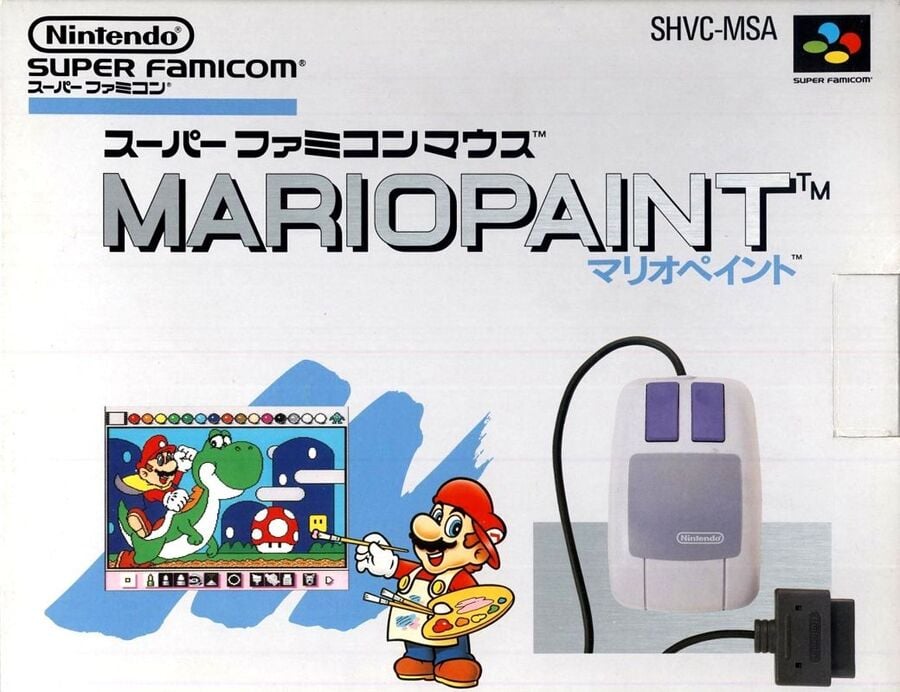
Gosh, this looks more like something from Nintendo’s ‘Wii era’, right? It’s a clean design with a more modern logo. Meanwhile, the mix of white and blue is incredibly reminiscent of the Wii aesthetic. Maybe Nintendo looked to this very specific box art for inspiration? Hmm…
Otherwise, the SNES Mouse is very much the star of the show here, while Mario’s painting is probably a more accurate depiction of what’s actually possible within the game itself.
Thanks for voting! We’ll see you next time for another round of the Box Art Brawl.

Laura Adams is a tech enthusiast residing in the UK. Her articles cover the latest technological innovations, from AI to consumer gadgets, providing readers with a glimpse into the future of technology.

