Hi folks, and welcome back to Box Art Brawl!
Looking back on last week, Tetris Attack on the Game Boy entered the ring for a classic duel, with North America and Europe going head-to-head against Japan. Rather expectedly, including Nintendo’s characters gave Japan a significant advantage, and the region won comfortably with 75% of the vote.
This week, we’re jumping ahead slightly to the Game Boy Advance with Mario Golf: Advance Tour, the counterpart for the GameCube’s Mario Golf: Toadstool Tour. Released in 2004, it would retain many of the RPG elements that shaped previous titles, and went on to receive high critical reception.
Much like last week, it’s another duel with the Western design going up against the Japanese design, so without further ado, let’s get started…
Be sure to cast your votes in the poll below; but first, let’s check out the box art designs themselves.
North America / Europe
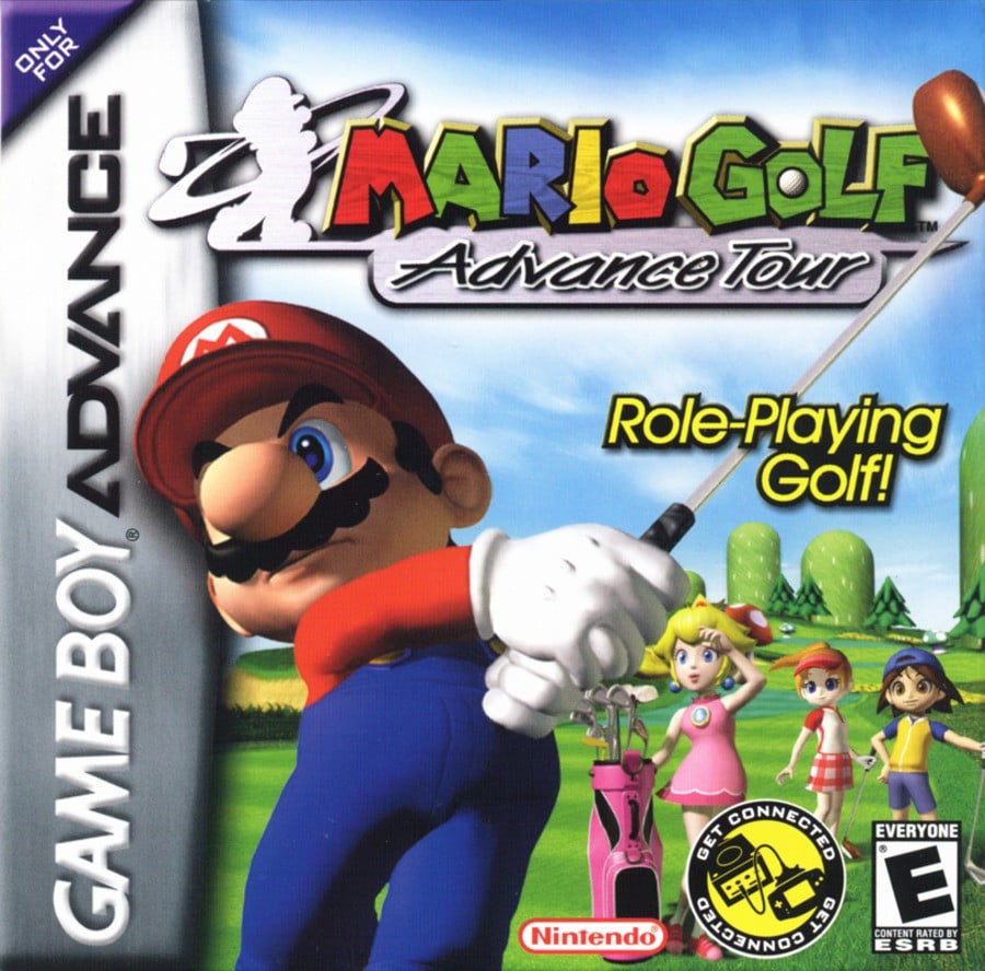
Okay, boom, look at Mario there, how cool does he look, huh? We love how he slightly overlaps the GBA branding on the left, too. It’s a very bold image, and Nintendo made great use of the background space too, adding additional characters to marvel at Mario’s pristine form.
Japan
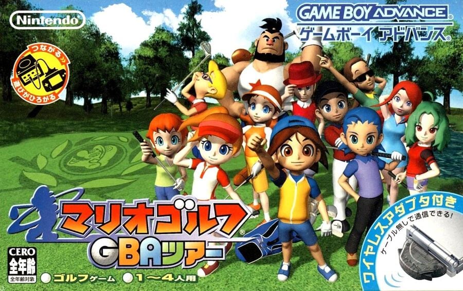
Hold up… Where’s Mario?! Okay, he’s on the grass, but gosh, it’s kinda weird to have a Mario Golf game without the main man himself, right? It’s like the total opposite of last week’s clash with Tetris Attack. Nevertheless, this is still a cool image; we’re always game for a composition that includes a whole bunch of interesting characters. The environment is also a touch more realistic than the Western design, which makes for a nice touch, even if it’s not quite representative of what’s in the game.
Thanks for voting! We’ll see you next time for another round of the Box Art Brawl.

Laura Adams is a tech enthusiast residing in the UK. Her articles cover the latest technological innovations, from AI to consumer gadgets, providing readers with a glimpse into the future of technology.

